Some of the best interiors designers agree that certain colors can create a pared-down look that’s anything but austere. In fact, neutrals don’t have to be boring and when it comes to decorating, a neutral palette doesn’t always to start and end with beige or white. Sasha Bikoff, Henriette von Stockhausen and Anne Hepfer, are some of the experts in the field of interior design who are using these “new neutrals”. Read on to see the latest trends for Spring Design Inspiration using New Neutrals.
BLUSH

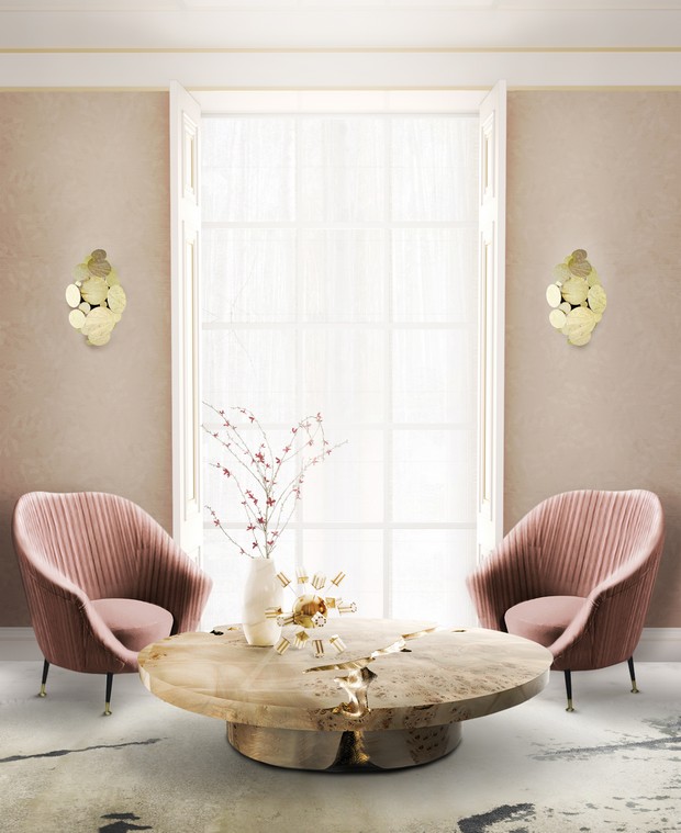

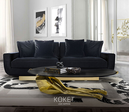
Blush has a cream and yellow base that makes it a neutral, as opposed to pinks with purple undertones, according to Bikoff. “The light blush in this living room works great as a backdrop to other neutrals and pops of color, like canary yellow, which complements the blush in a beautiful, unassuming way.”
See Also: Kelly Hoppen Best Interior Design Projects with Neutral Colors


Like these decor tips using neutral colors? In that case you might also want to read Neutral-Paletted Bedroom Designs for This Spring.