In luxury interior design, colour has the power to transform. But sometimes, it’s not bold hues or dramatic contrasts that make the statement—it’s the subtle strength of neutral tones. Elegant, versatile, and timeless, a neutral colour palette can be the cornerstone of sophisticated design, exuding luxury without overwhelming the senses.
Article You’ll Love: Luxury Trends For Fall 2025: The Art of a Grand Welcome

What Are Neutral Tones?
Neutral shades include beiges, taupes, soft greys, creams, off-whites, and sometimes muted blush or greige tones. The magic lies in the undertones—warm neutrals bring comfort and richness; cool neutrals offer a crisp, modern aesthetic.
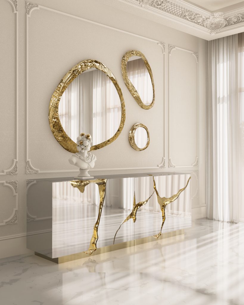
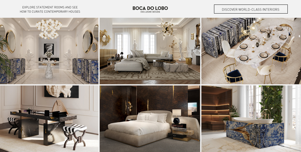
Lapiaz Sideboard & Halo Mirror


Why Neutrals Feel Luxury
- Timelessness: Unlike trendy colours that fade in popularity, neutrals endure. They provide a foundation that works across styles and decades.
- Light Amplification: Neutral walls and surfaces reflect both natural and artificial light beautifully—making spaces appear brighter, larger, and more inviting.
- Material & Texture Play: Luxury interiors often show off textures—velvet, silk, natural wood, marble, brass. Against a neutral backdrop, these materials become more pronounced and dramatic.
- Calm & Sophistication: Neutral tones calm the eye. They make a space feel ordered, intentional, and serene—qualities often associated with upscale homes.

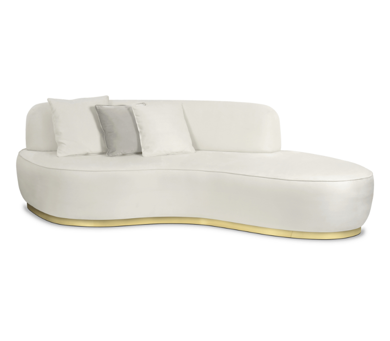
Angra Sofa

Choosing the Right Palette
- Assess the light source: North-facing rooms tend to have cooler light, which can make warm neutrals feel yellowish, while south-facing rooms can make cool neutrals feel sterile.
- Match undertones: If you choose a warm beige, pair materials with similar warmth—gold metals, warm woods. For cooler greys, use chrome, glass, or marble with cool veining.
- Balance: Use lights, shadows, and texture differences to avoid flatness. A single shade of neutral everywhere can look bland unless textures are varied.
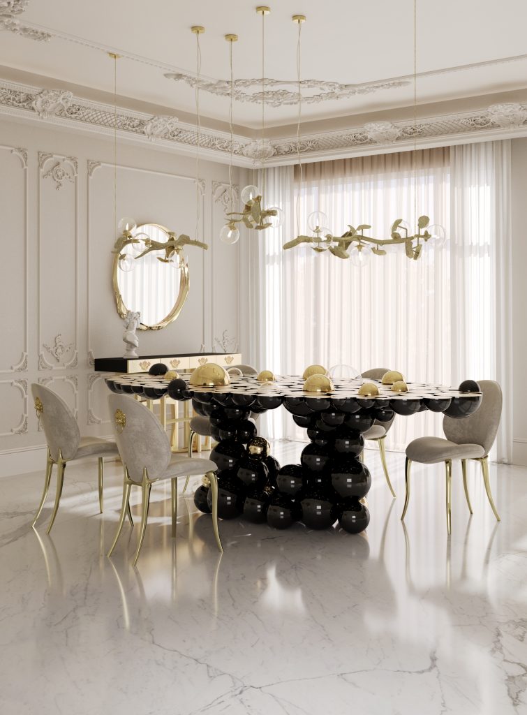
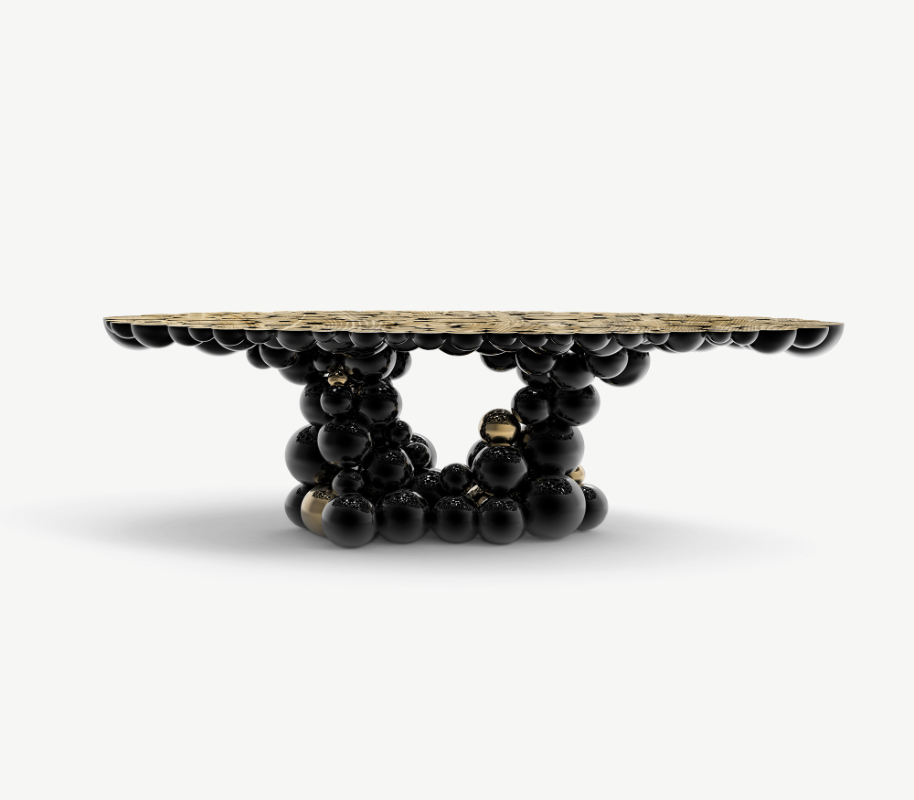
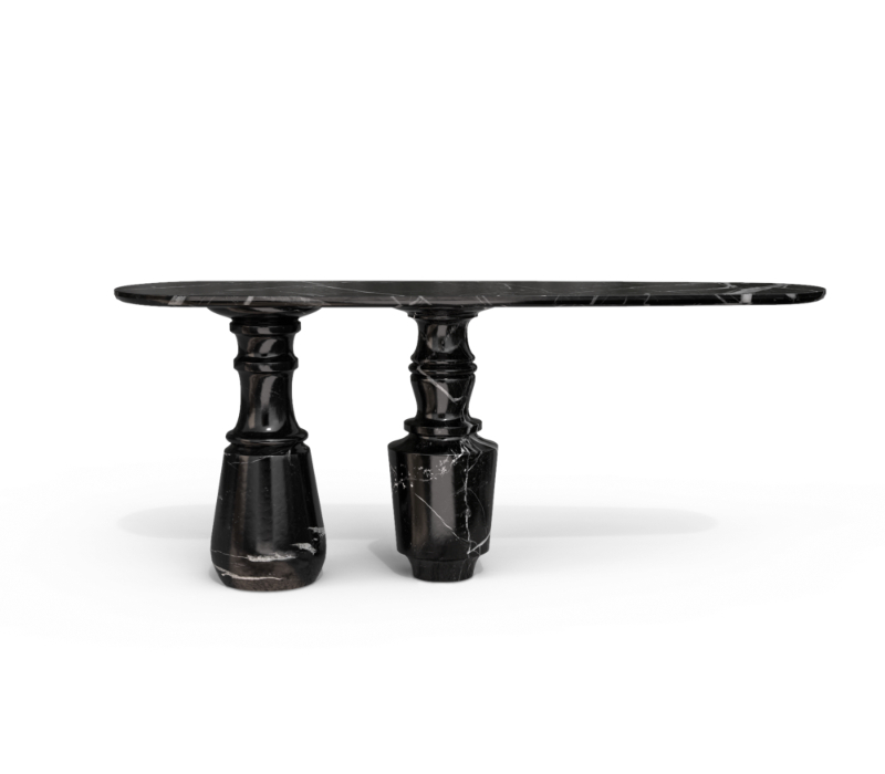
Newton Dining Table & Soleil Dining Chair

Applying Neutrals to Luxury Interiors
- Walls & Ceilings: Choose neutral paint colours with quality finishes—matte, eggshell, or subtle sheen—to enhance the sophistication.
- Furniture & Upholstery: Custom sofas in neutral fabrics can read as high-end when paired with elegant lines and craftsmanship.
- Fabrics & Accessories: Layer rugs, throws, and cushions in similar tones with varied textures—silk, wool, cashmere—to enrich the composition.
- Statement Accents: A charcoal marble fireplace, a sleek brass light fixture, or a bold piece of art can anchor the space without breaking the neutral harmony.

Odette Sofa & Pietra Console
Avoiding Common Pitfalls
- Flatness: To avoid a space looking too monochrome, mix up shades, textures, and finishes.
- Lighting Gaps: Poor lighting leads to neutrals appearing dull or unnatural. Prioritise layered lighting—ambient, task, accent.
- Wrong undertones: Buying swatches and testing small patches helps avoid tones clashing.

Lapiaz Console & Robin Mirror


Neutral tones are more than a safe choice—they’re a refined choice. For interior design that whispers rather than shouts, that promises luxury in every detail, they are unmatched. If you’re considering elevating your space with timeless elegance, explore Boca do Lobo’s range of neutral-tone furnishings and finishes. Embrace simplicity. Elevate the senses.
See Also: Modern Maximalism: Inspiring Ideas for Luxe Interiors