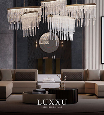
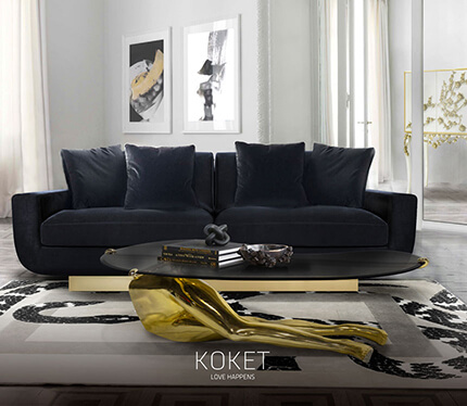
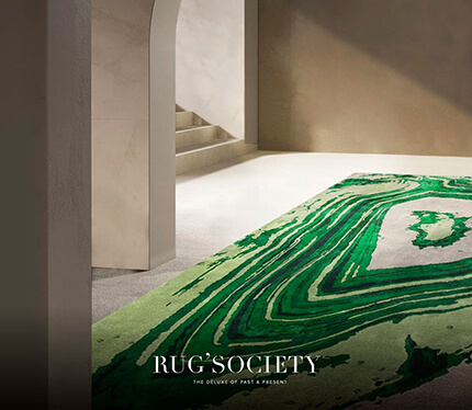
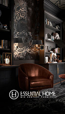
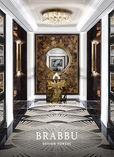
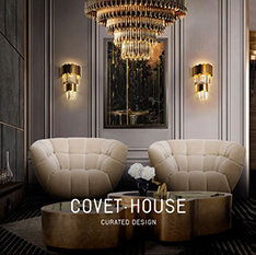
Color is at the heart of all we do. Fulfilling our intrinsic desire for change, we apply color to our walls, the cars we drive, the face we see in the mirror each day, the clothes we wear and also the furniture in our home. Looking at color as a total language, this multi-platform forecast offers seasonal design inspiration, key color direction and suggested color harmonies for home décor and fashion design. Today we’ll show you 10 Inspiring Living Rooms Using Winter Pantone.
See also: Top 100 Architects and Interior Designers by AD | 2017
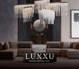
With color going hand and hand with texture this season we are also interested in materials that emit and reflect light; we explore embellished finishes and perfect smooth, shining surfaces. We see how transparency reveals and alters color, and how thick cocooning materials muffle shape and change its meaning.
Harmony is nature’s way of saying that two or more things together make sense. Color harmony represents a satisfying balance or unity of colors. Combinations of colors that exist in harmony are pleasing to the eye. The human brain distinguishes the visual interest and the sense of order created by the harmony and forms a dynamic equilibrium.

Dusty Cedar

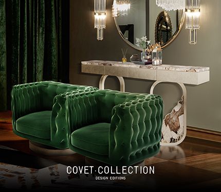
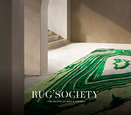
Lush Mealow

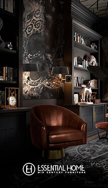
Potter’s Clay

Skarkskin

You may like: DESIGN INSPIRATIONS – FURNITURE AND FASHION
That was our suggestions of 10 inspiring images of examples of Winter Pantone to use in your luxury Living Room. What do you think about these colors?
Please give us your feedback and keep an eye out for more interior design ideas.