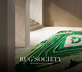
Matching tones and playing with the right colour palette is fundamental in achieving the right look in any interior setting. Notably, knowing where and how to explore the palette will make all the difference in the bigger picture.
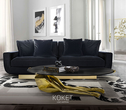
More times than not, it comes down to detail, and that is true for colours, tones, shapes and lighting. The example above exemplifies the importance of colour-matching details, balanced with appropriate materials and shapes. A close look sees a mellow mix of green and turquoise tones, from rug to artwork, which are beautifully complimented by gold components such as the picture frames, and side table.
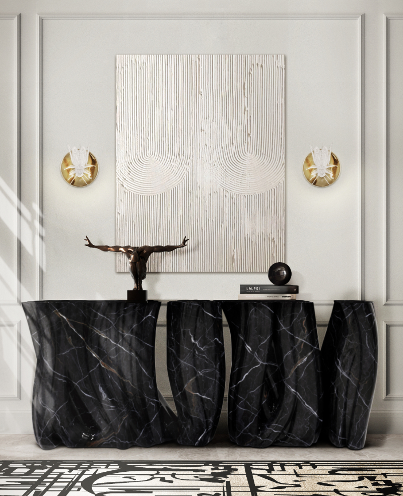
It’s important to balance these elements out with neutral furniture pieces, such as the Black Soho Center Table, which blends well into the environment and can gives the environment a sobering touch.